Project Overview
What is Uptime Advisors?
Uptime Advisors works behind the scenes of a business.
They help companies organize how things run by building custom dashboards and systems so managers can clearly see what’s happening in real-time.
Smart Dashboards:
Prevent problems before they happen
Keep operations smooth and predictable
Goal
The goal wasn’t just to design a good-looking website.
We wanted to build something that actually works as a decision-making tool.
A visitor especially a CEO or Operations Manager should be able to:
Understand the value quickly
See how it helps their business
Feel confident enough to reach out
Core Features
Smart Dashboards:
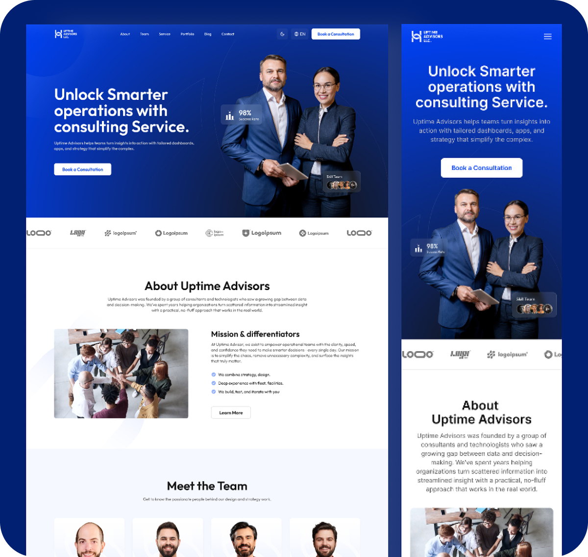
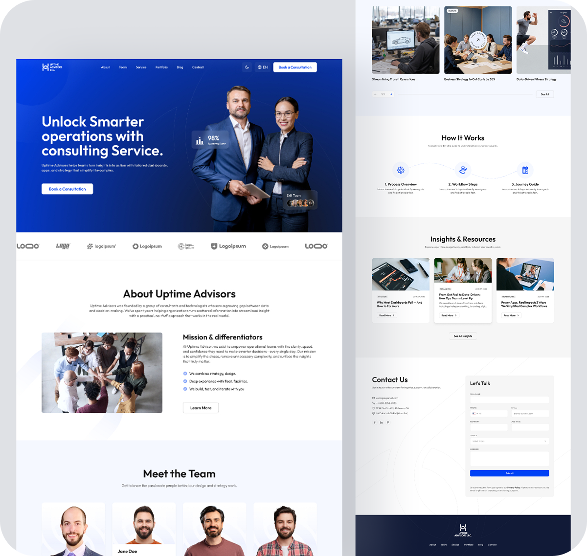
We designed sections that visually explain how their dashboards track real-time data.
Easy Navigation:
Users can move through services without getting stuck in technical terms.
Expert Insights:
A blog section where they share practical business strategies and ideas
Proof of Success:
Clear sections for client logos, testimonials, and results to build trust.
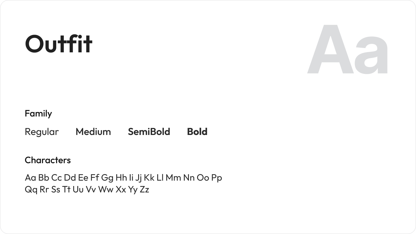
Editorial Typography
The Uptime Advisors LLC brand uses Outfit as its primary typeface. Outfit is a modern geometric sans-serif that balances professionalism with approachability. The family includes Regular, Medium, Semi Bold, and Bold weights.
Color Pallete
The color system is built around three shades of blue that create depth, authority, and trust.
-up-1782366133428.png)
-1782366152472.png)
Design Challenges
Uptime Advisors deals with a lot of technical and complex information.
If we showed everything at once, it would overwhelm users.
So the real challenge was:
How do we simplify without losing meaning?
We solved it by:
Using clean layouts
Breaking content into small sections
Keeping everything easy to scan
Research Goals
Understanding Competitors:
We reviewed other consulting websites to see what works and what feels confusing.
Understanding Users:
We focused on real problems users face like system failures, inefficiency, and wasted cost.
SEO Direction:
We used keywords that match what people actually search for, like improving operations or reducing business costs.
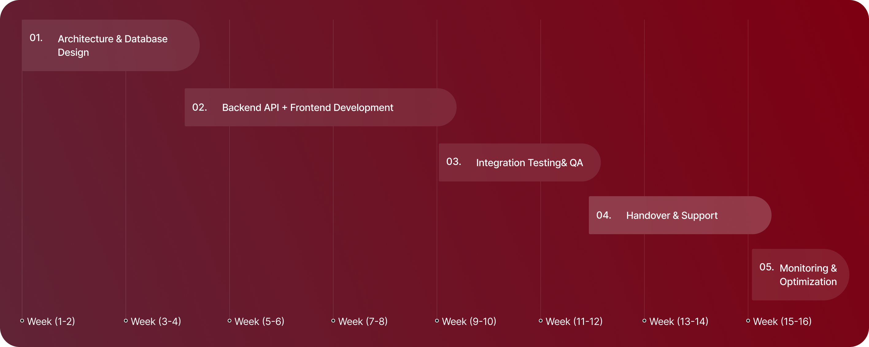
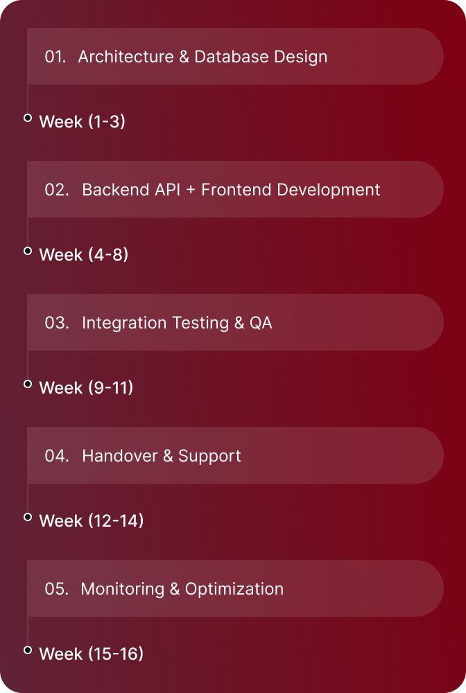
Process Behind This Project
01.
Setting the Direction
We started with one key question: “What does a client need to feel before they trust this company?” The answer was simple clarity and confidence.
02.
Research & Structure
We studied how users interact with data-heavy websites to avoid clutter and confusion.
03.
Wireframing
We created basic layouts to map the full journey from landing on the homepage to contacting the team.
04.
Visual Design
We used: - Deep blue tones for trust - Clean typography for readability - Simple layouts to reduce mental effort
05.
Final Handoff
All designs were organized and prepared for developers to implement without confusion.