Loading...
Why Microinteractions Matter in Modern App Design
June 14, 2026
8 min read

What Are Microinteractions?
Microinteractions are small, single-purpose animations or design moments that happen in response to a user action. They do one specific thing: confirm, guide, provide feedback, or just make an experience feel alive.
Some examples you've definitely used:
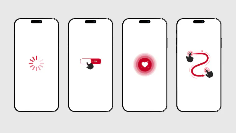
The heart animation when you like a post on Instagram
The loading spinner that tells you something is happening
The shake on a login form when you enter a wrong password
The toggle switch that slides when you turn on dark mode
The small sound and vibration when your phone goes to silent mode
These are not big features. They don't show up in press releases. But they directly shape how users feel about your product.
Why Microinteractions Are Not Optional Anymore
A few years ago, microinteractions were considered a nice-to-have. Today, they're expected.
Here's why that shift happened.
Users are more sophisticated. People use dozens of apps daily. They've been trained by products like Apple, Google, and Airbnb to expect polish. When an app feels stiff or unresponsive, users assume something is wrong.
Competition is brutal. If two apps solve the same problem, users will almost always choose the one that feels better. Microinteractions are one of the fastest ways to create that emotional advantage.
Attention spans are shorter. Users make decisions about an app in seconds. First impressions happen at the interaction level, not just the visual level. A clunky button or a laggy form can kill trust before a user even gets to your main feature.
The 4 Parts of a Microinteraction
Designer Dan Saffer wrote a book on this topic in 2013. His framework is still the clearest way to understand how microinteractions work.
1. Trigger This is what starts the microinteraction. It can be user-initiated (tapping a button) or system-initiated (getting a notification when you get a new follower).
2. Rules What happens after the trigger fires? The rules determine the behavior. Press the like button: the count goes up by one, the icon fills with color, a small animation plays.
3. Feedback This is what the user sees, hears, or feels. Visual feedback is most common, but haptic feedback (vibration) and audio feedback also count. The feedback tells the user their action worked.
4. Loops and Modes What happens over time? Does the animation repeat? Does the behavior change if you're offline? Loops and modes handle the "what if" scenarios.
Getting these four parts right is what separates microinteractions that feel smooth from ones that feel clunky.
Real Business Impact of Microinteractions
This is where designers sometimes struggle to convince stakeholders. Microinteractions sound like decoration. But the data tells a different story.
They reduce user errors. A form that shakes when you enter an invalid email is annoying in the best way possible. It catches the mistake before the user submits and gets frustrated. That saves support tickets, saves time, and keeps users happy.
They increase completion rates. Progress indicators, step-by-step animations, and micro-confirmations keep users moving forward. They reduce the anxiety of "did my action do anything?" which is one of the most common reasons users abandon forms and checkouts.
They build brand identity. The way Duolingo's owl reacts when you finish a lesson. The way Slack's sending animation works. The way Apple's haptic feedback feels on a long-press. These things aren't random. They're deliberate brand decisions expressed through tiny interactions.
They improve perceived performance. An app with a well-designed loading animation feels faster than an app that just freezes with no feedback. This is not an illusion. It's UX psychology. When users know something is happening, they're more patient.
Common Microinteraction Mistakes to Avoid
Too slow. An animation that takes longer than 300-400ms starts to feel like the app is lagging. Keep it fast.
Too flashy. Just because you can add a full particle explosion to a button click doesn't mean you should. Microinteractions should support the task, not distract from it.
No feedback at all. This is the most common mistake on low-budget apps. A button that does nothing visually when tapped feels like it didn't register. Always give visual confirmation.
Inconsistent across screens. If your toggle animation is smooth on one screen and instant on another, it feels like two different products. Consistency is everything.
Ignoring accessibility. Users with vestibular disorders can be affected by too much motion. Always offer a reduced-motion option in your settings. Follow WCAG accessibility guidelines.
Where to Use Microinteractions in Your App
Not every element needs a microinteraction. Here's where they have the most impact:
Forms: Inline validation, error states, success confirmations
Buttons and CTAs: Press states, hover effects, loading indicators
Navigation: Page transitions, tab switches, drawer open/close
Empty states: Friendly animations when there's no content yet
Notifications: Badge animations, notification pop-ins
Data loading: Skeleton screens, progress bars, spinners
Gestures: Swipe feedback, pull-to-refresh, pinch-to-zoom
Each of these is a moment where the user is waiting or deciding. Microinteractions fill that moment with something useful.
Tools Designers and Developers Use for Microinteractions
Figma is still the most common tool for designing and prototyping microinteractions before development. With Smart Animate and component properties, you can communicate the intended motion to developers clearly.
Lottie (by Airbnb) lets designers export animations from After Effects directly into mobile and web apps. It's lightweight and works on iOS, Android, and the web.
Framer Motion is a popular React animation library that makes it easy for developers to build microinteractions with code that's clean and maintainable.
CSS transitions and animations handle most simple microinteractions on the web. No library needed. Just clean, well-written CSS.
Microinteractions and Mobile vs. Web
On mobile, microinteractions carry more weight because touch is more personal than a mouse click. When you tap something with your finger, you expect the response to feel immediate and tactile.
On web, hover states are an extra layer that mobile doesn't have. This means web designs can use hover microinteractions for preview effects, tooltips, and revealing secondary actions. Mobile has to rely on tap states, long-press menus, and swipe gestures instead.
The core principle stays the same: every interaction should feel intentional and every action should get a response.
What Good Microinteraction Design Actually Looks Like
Here's a simple test. Pull up two apps that do the same thing. One is well-funded and design-focused. The other is a cheaper alternative.
Use both for five minutes.
The difference you feel isn't usually about features. It's about how the app responds to you. Whether it feels alive or dead. Whether pressing a button feels satisfying or hollow.
That difference is almost entirely built from microinteractions.
Good microinteraction design is invisible to users. When it's working, no one says "wow, great microinteraction on that button." They just feel like the app is good. When it's missing or broken, they say the app feels cheap or buggy, even if the core functionality works fine.
Takeaway for Product Teams
If you're building an app, microinteractions should be part of your design system from day one. Not added at the end as polish. Not skipped because of budget. They're as functional as typography or color, because they communicate state, confirm actions, and guide users without a single word of copy.
At Wincasoft, we build products where these details are baked into the design process, not tacked on afterward. If you want your product to feel as good as it works, that's the right approach.
Looking to build a polished digital product? Get in touch with Wincasoft to work with a team that takes UX seriously at every level.


Your Team, Without the Hiring Hassle
Your team is ready. No hiring process needed.
Hire a Dedicated Team