
Project Overview
What is TravelPro?
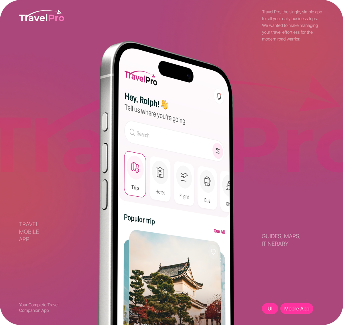
TravelPro is a travel planning and booking mobile application designed to be a single destination for trip discovery, hotel booking, flight search, and local exploration. The app greets users personally and immediately surfaces popular destinations, making the experience feel curated rather than overwhelming. With destination detail pages, review summaries, cost breakdowns, and one-tap booking, TravelPro covers the complete travel planning journey from inspiration to confirmation.
Goal
The design goal was to build a warm, visually rich mobile UI that makes travel planning feel exciting and stress-free. The app needed to balance rich destination imagery with clean, readable information architecture so users could move from browsing to booking without friction.
Core Brand Elements
TravelPro uses a vibrant pink and white color scheme that feels energetic and modern without sacrificing readability. The home screen leads with a personalized greeting and a multi-category navigation bar covering trips, hotels, flights, buses, and more. Destination cards use full-bleed photography with overlay text to create an immersive browsing experience.
Key Screens Designed
Splash screen with destination photography and a clear value proposition
Homepage with personalized greeting, category navigation, and popular trip cards
Destination detail page with overview, cost, distance, temperature, and reviews
One-tap booking flow with pricing displayed prominently
Editorial Typography
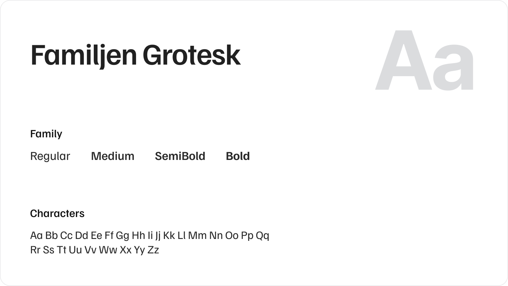
TravelPro uses Familjen Grotesk as its primary typeface across all screens. Familjen Grotesk is a warm, distinctive grotesque that balances personality with readability, making it a strong fit for a travel app that needs to feel both exciting and easy to navigate. The family includes Regular, Medium, SemiBold, and Bold weights.
Color Pallete
-Travel-Pro-1782457705538.png)
-Travel-Pro-1782457714209.png)
Design Challenges
Travel apps live or die on how well they balance visual richness with usability. The main challenges on this project included the following:
Destination content is highly visual, but the UI still needed to be fast and scannable.
The booking flow had to feel simple enough for first-time users while surfacing enough detail for experienced travelers
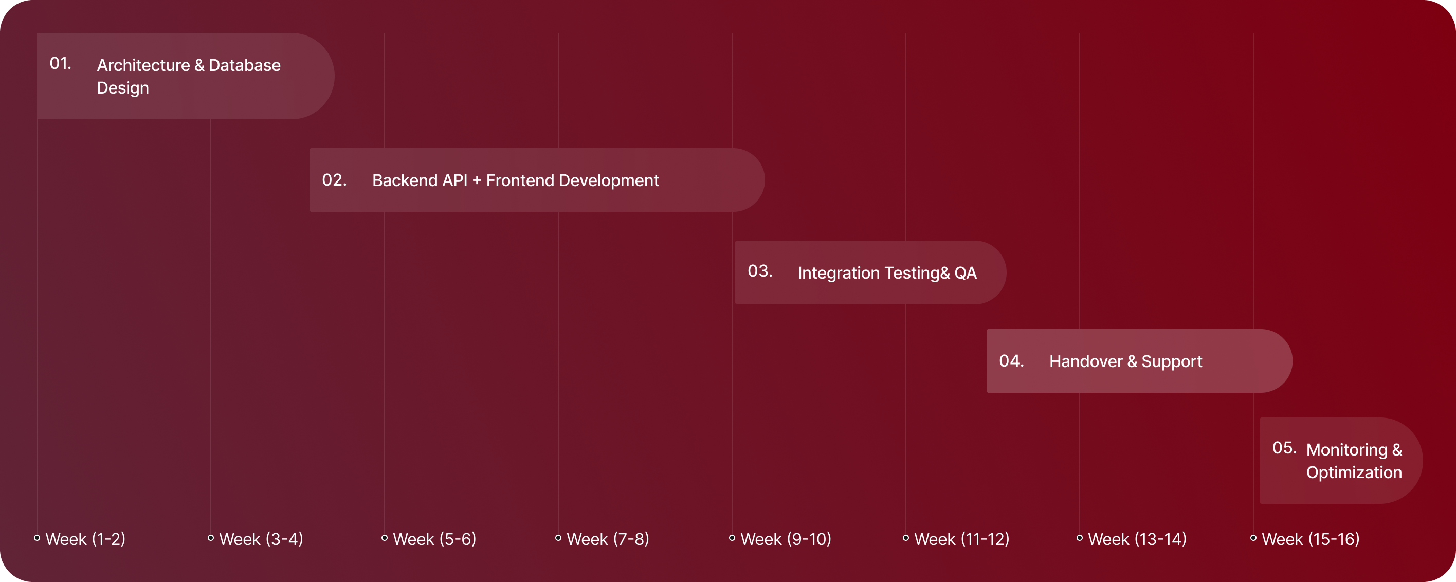
Process Behind This Project
01.
Discovery & Planning
We started by studying how travelers actually plan trips, from destination research to booking confirmation. This helped us map the full user journey and identify where the app needed to reduce friction the most.
02.
Architecture Design
We structured the app around five core actions: Trip, Hotel, Flight, Bus, and Shopping. Each category got its own navigation path while staying connected through a unified home dashboard and search experience.
03.
Development
We designed every screen with a mobile-first approach, making sure destination cards, booking flows, and detail pages worked seamlessly across different screen sizes and interaction patterns.
04.
Testing & QA
We tested the full booking flow from destination discovery through to the Book Now confirmation, refining tap targets, loading states, and error handling to make the experience feel smooth and reliable.
05.
Deployment
We prepared all final screen assets, component documentation, and design handoff files to ensure the development team could build each screen accurately without back-and-forth clarifications.
06.
Monitoring & Maintenance
Post-launch, we established a feedback loop to track how users moved through the discovery and booking flow, using those insights to prioritize improvements to the search and destination detail screens.