Project Overview
What is Uptime Advisors LLC?
Uptime Advisors LLC is a US-based strategic consulting firm that helps business teams uncover operational inefficiencies and implement practical, data-driven solutions. With a 98% client success rate, they specialize in turning complex workflows into streamlined, high-performance systems through tailored dashboards, apps, and consulting strategies.
Goal
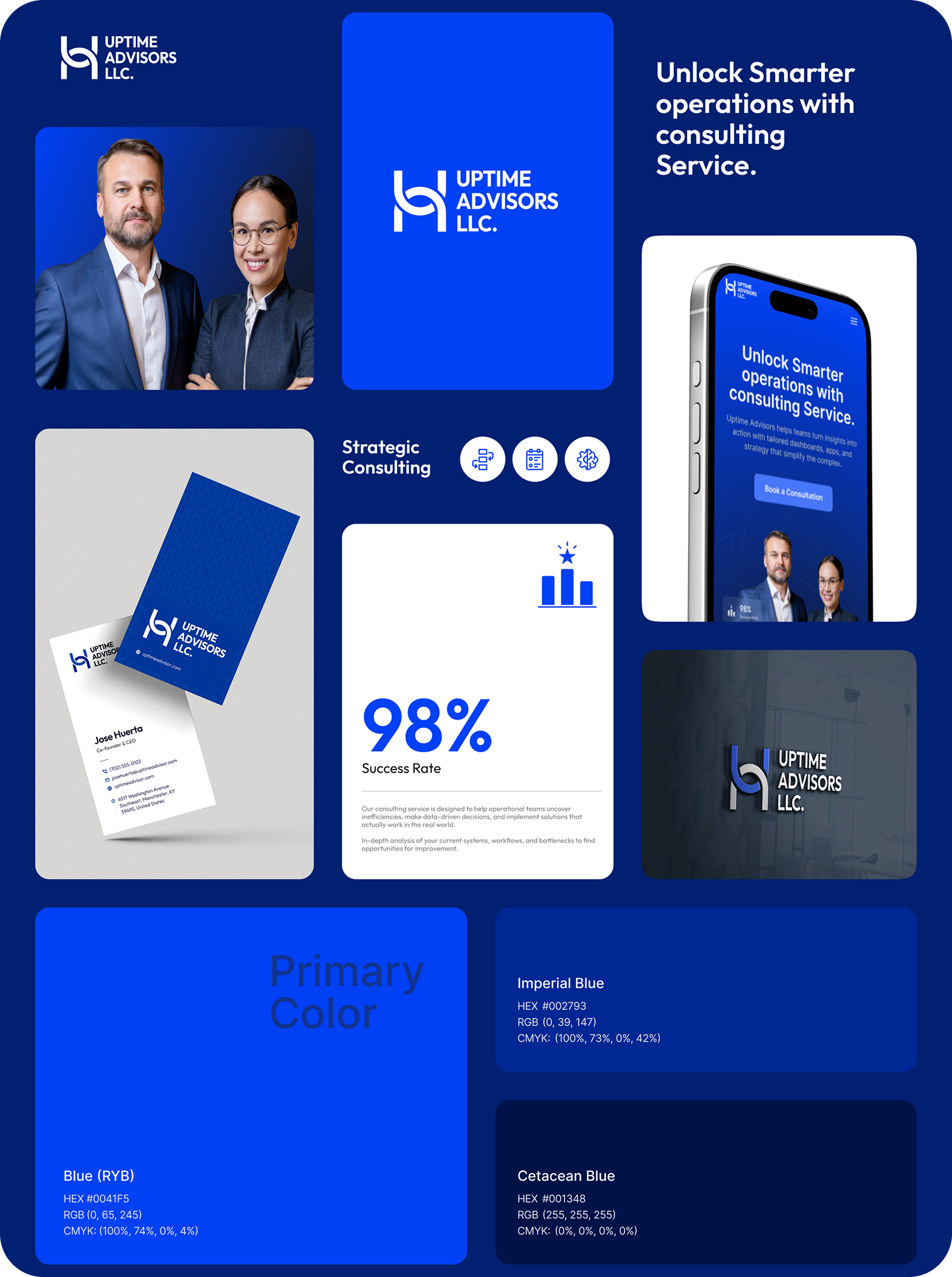
The goal of this project was to design a bold, trustworthy brand identity that reflects the firm's expertise in strategic consulting. The brand needed to communicate professionalism, reliability, and clarity while standing out in the competitive B2B consulting space.
Core Brand Elements
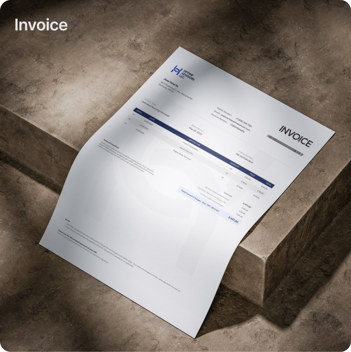
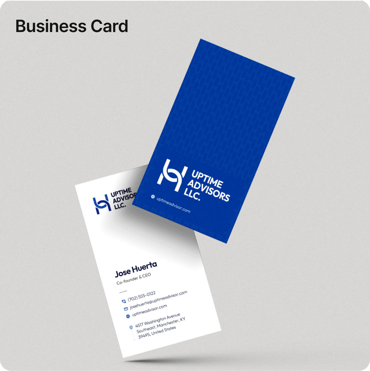
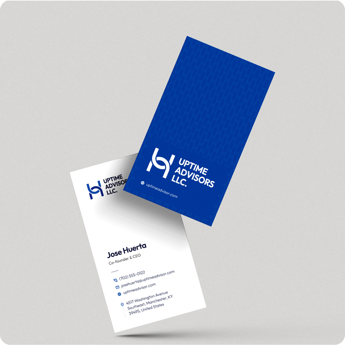
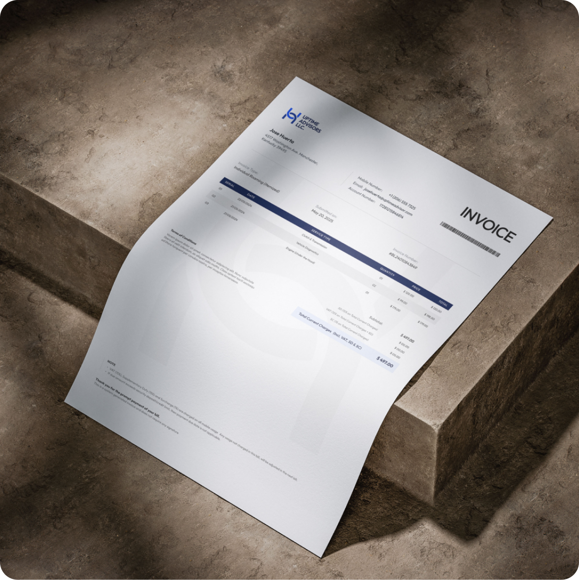
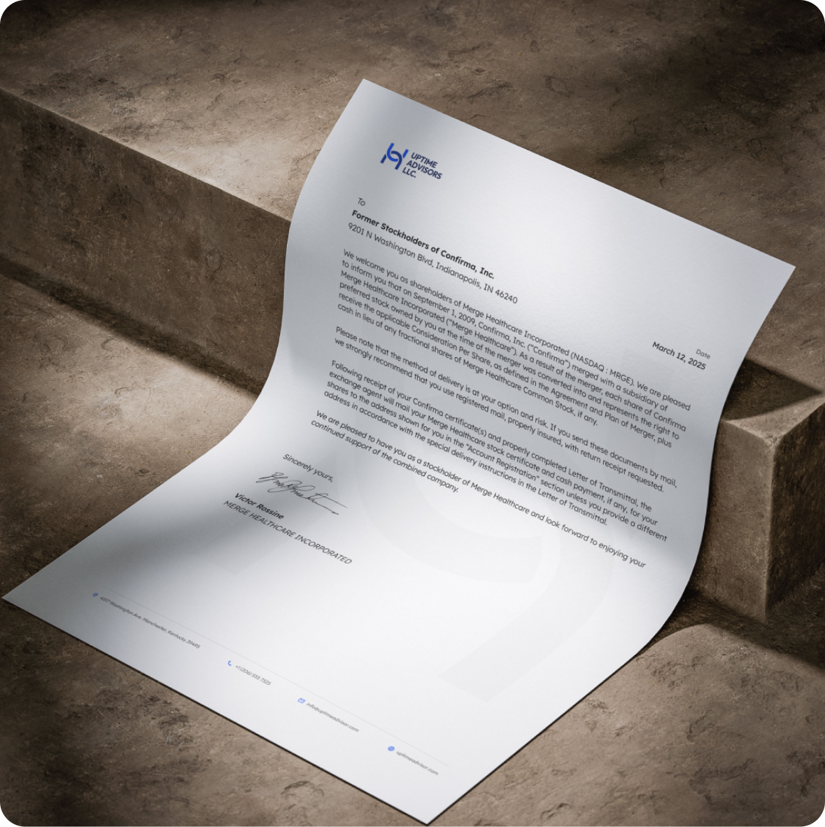
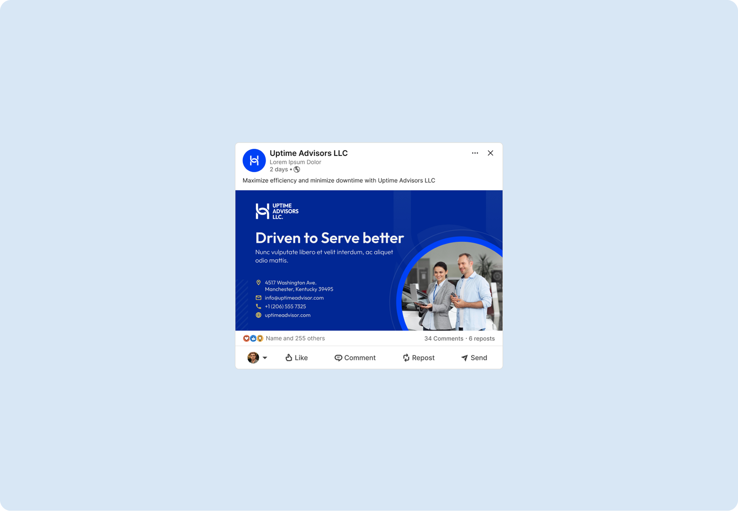
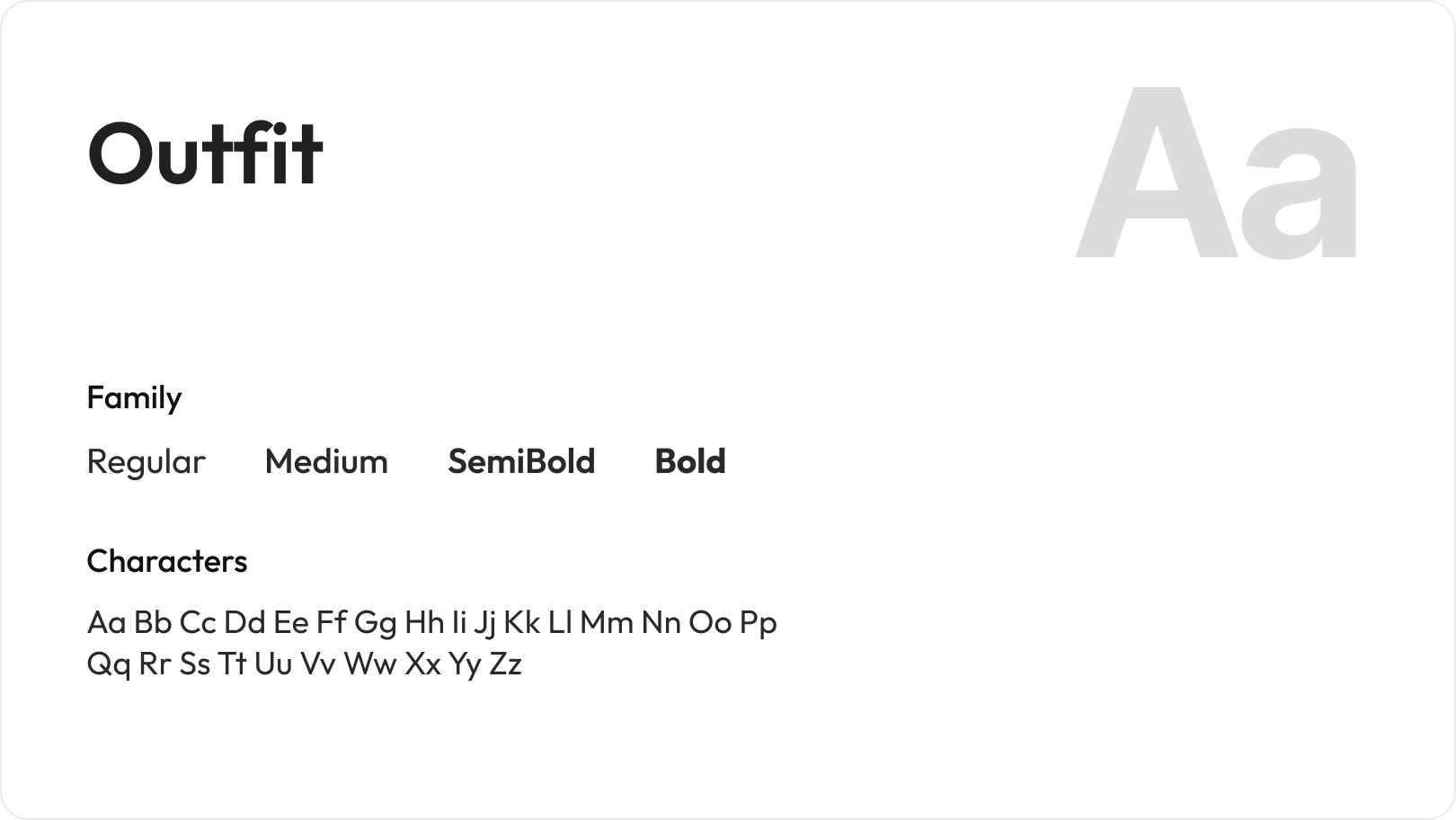
The visual identity centers on a clean wordmark logo built with strong geometric forms, paired with a deep royal blue color palette that signals authority and confidence. The typography is modern and structured, reinforcing the firm's analytical mindset. Business card design and mobile web UI were developed in the same language to ensure consistency across all brand touchpoints.
Logo
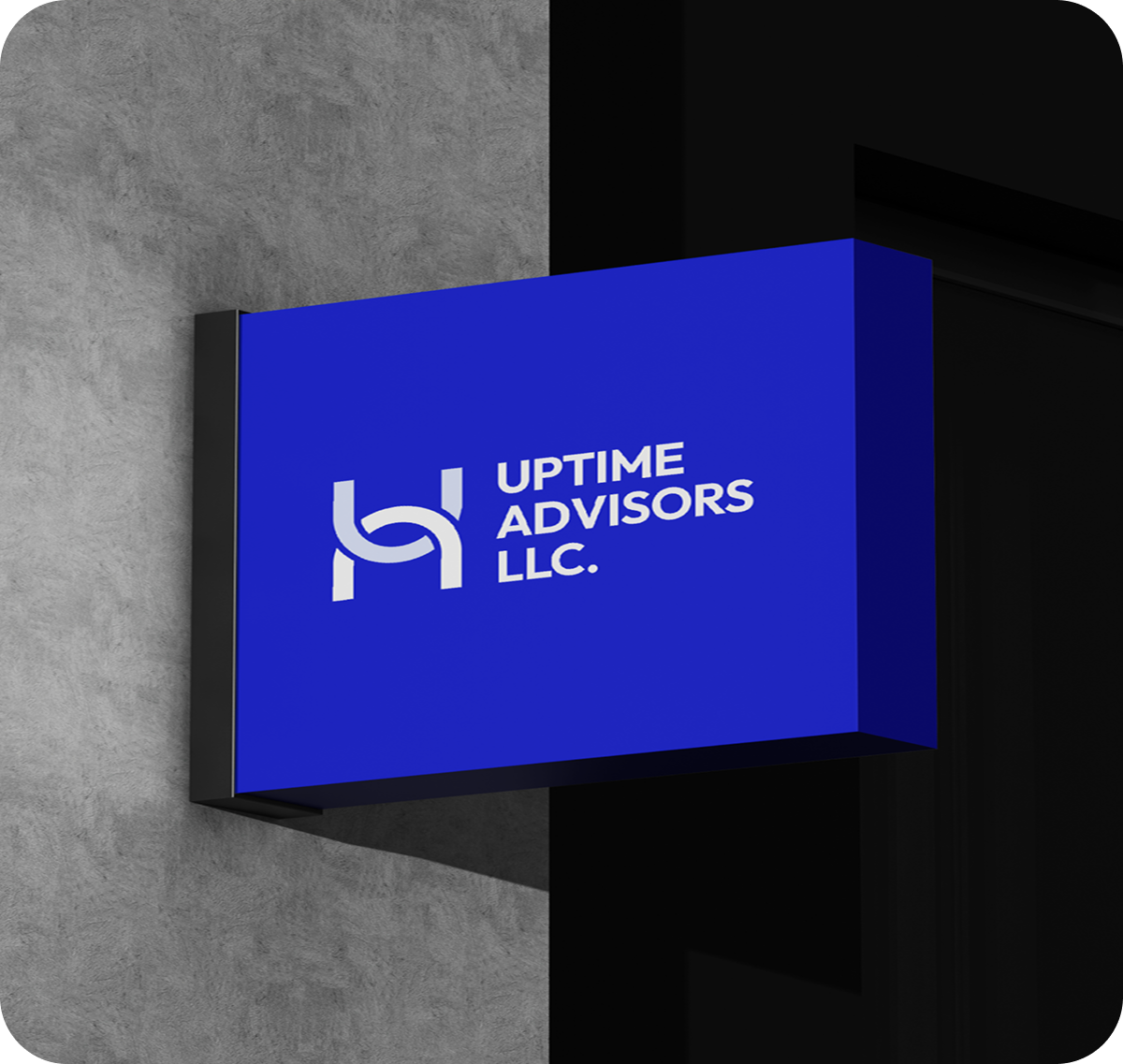
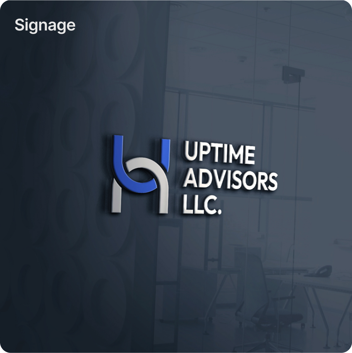
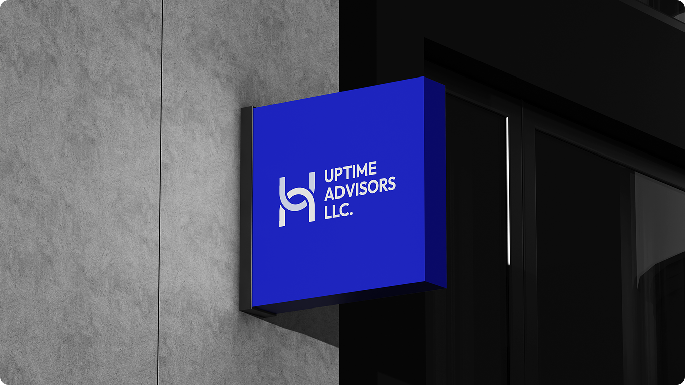
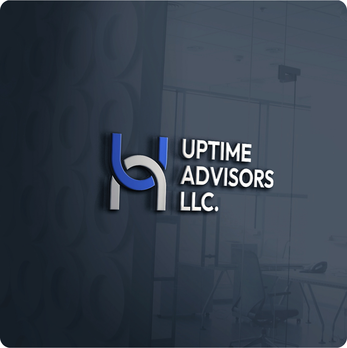
The Uptime Advisors logo uses a custom letterform construction that blends the initials into a single cohesive mark. It works across white, blue, and dark backgrounds, making it highly versatile for both digital and print applications.
Editorial Typography
Color Pallete
-up-1782386099705.png)
-1782386110318.png)
Visual Texture
Usually when designing a logo it will be in the wider context of the brand. The logo is just one part of how the brand communicates. Having said that, depending on the brand, the logo can play a major role in the brand communication. Some logos such as Google’s take a front seat while others are more subtle and let other parts of the brand dominate. Here is an overview of the process I use when designing a logo in the context of a larger branding project.


Brand Challenges
Consulting brands often look either too corporate or too generic. The key challenges for this project included the following:
The brand needed to feel premium without becoming cold or unapproachable.
The logo had to scale cleanly across mobile screens, business cards, and large-format displays.
We solved this by anchoring the design in a confident blue system with ample white space and a structured typographic hierarchy.
Process Behind This Project
01.
Discovery & Planning
We started by reviewing Uptime Advisors' positioning as a strategic consulting firm, understanding their target audience, core services, and the professional tone the brand needed to communicate across all touchpoints.
02.
Architecture Design
We mapped out all the brand elements that needed to be created, from the primary logo and wordmark to business card layouts and mobile web UI, making sure every piece worked within a single cohesive system.
03.
Development
We explored multiple logo directions before landing on the custom geometric letterform that balances structure and sophistication. Each design decision was tested across white, blue, and dark backgrounds to ensure full versatility.
04.
Testing & QA
We reviewed the complete brand system across print and digital applications, checking legibility, color accuracy, and scalability at every size from business card to mobile screen.
05.
Deployment
We packaged and delivered all final brand assets including logo files, color codes, typography specifications, and usage guidelines, giving the client everything needed to apply the identity consistently.
06.
Monitoring & Maintenance After handoff
we remained available to support any additional brand applications, ensuring the identity stayed consistent as Uptime Advisors expanded their digital and marketing presence.